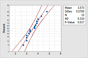
The scales are transformed as necessary so that the fitted distribution forms a straight line.
Use to evaluate the fit of a distribution to your data, estimate percentiles, and compare different sample distributions. A probability plot does the following:
|
|
The scales are transformed as necessary so that the fitted distribution forms a straight line. |
For example, a regional fast food restaurant manager would like to know the percentage of customers who have to wait the target time of 4 minutes or less for their food. He records the wait times for 15 customers, represented by the probability plot above. The probability plot reveals the following:
The plot above shows samples from only one restaurant. The manager could also display and compare data for several restaurants on the same probability plot.
A probability plot performs a similar function as an empirical CDF plot. An advantage of a probability plot is that you can judge the distribution fit by viewing how the points fall about the line.
Probability plots are also known as Rankit, QQ, Quatile, and PP plots.