Run chart
A simple graphic representation of process data over time. Use a run
chart to look for evidence of special causes variation in your process.
Special causes arise from outside the system and cause recognizable patterns,
shifts, or trends in the data. A process is in control when special causes
of variation has been eliminated.
A run chart plots the individual observations in the order that they
were collected, and draws a horizontal reference line at the median. When
the subgroup size is greater than one, the subgroup means or medians are
plotted and connected with a line. Run charts also perform two tests for
randomness that provide information on non-random variation due to trends,
oscillation, mixtures, and clustering in your data. Such patterns suggest
that the variation observed is due to special causes.
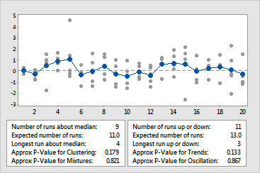
For example, a plastic manufacturer wants to assess its production process
for one of its new products. They sample 5 products every hour for 20
hours and test the strength of the plastic. The following run chart resulted.
|
|
The gray points represent the individual values. The blue points connected
with a line represent the means of subgroups. With the exception of one
observation, the points appear to vary randomly around the center line
(median). The approximate P-values for clustering , mixtures, trends,
and oscillation are all greater than the a
level of 0.05. Therefore, there is no indication of special causes variation
or non-randomness.
|