main topic interpreting results session command see also
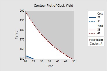
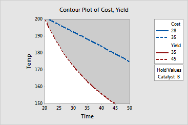
This contour plot is a continuation of the factorial response optimization example. A chemical engineer conducted a 2**3 full factorial design to examine the effects of reaction time, reaction temperature, and type of catalyst on the yield and cost of the process. The goal is to maximize yield and minimize cost. In this example, you will create contour plots using time and temperature as the two axes in the plot and holding type of catalyst at levels A and B respectively.
You do not need to re-analyze the models. The worksheet contains the models for the overlaid contour plot.
Step 1: Display the overlaid contour plot for Catalyst A
1 Open the worksheet FACTOPT.MTW.
2 Choose Stat > DOE > Factorial > Overlaid Contour Plot.
3 Click ![]() to select
both available responses.
to select
both available responses.
4 Under Variables, in X Axis, choose Time.
5 Under Variables, in Y Axis, choose Temp.
6 Click Contours. Complete the Low and High columns of the table as shown below, then click OK.
|
Response |
Low |
High |
|
Cost |
28 |
35 |
|
Yield |
35 |
45 |
7 Click Settings. Under Hold factors at, choose A as the setting for Catalyst.
8 Click OK in each dialog box.
Step 2: Display the overlaid contour plot for Catalyst B
9 Repeat steps 2-6, then click Settings. Under Hold factors at, choose B as the setting for Catalyst. Click OK in each dialog box.
Graph Window Output


Displayed are two overlaid contour plots. The two variables, temperature and time, are used as the two axes in the plots and the third variable, catalyst, has been held at levels A and B respectively.
The white area inside each plot shows the range of time and temperature where the criteria for both response variables are satisfied. Use this plot in combination with the optimization plot to find the best operating conditions for maximizing yield and minimizing cost.
This plot uses model equations. Ensure that your models are adequate before you interpret the plot.