main topic see also
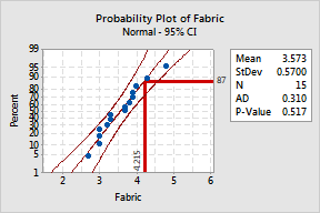
In Example of a probability plot, you created a graph with a percentile line. You can edit the line's attributes and label's font, alignment, and display.
|
Attributes Change the line color and size. 1 Double-click the percentile line. 2 Under Lines, choose Custom. 3 From
Color, choose
4 In Size, enter 3. 5 Click OK. |
|
|
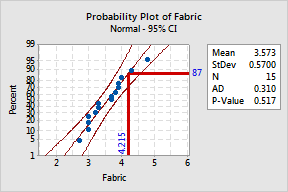
Font Change the label color, style, and size. 1 Double-click the percentile line label. 2 From
Color, choose
3 In Style, check Bold. 4 In Size, enter 14. 5 Click OK. |
|
|
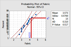
Alignment Change the label angle. 1 Select the percentile line label. 2 Select and double-click 87. 3 Click the Alignment tab. 4 In Angle, type 25. 5 Click OK. |
|
|
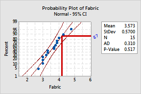
Show Hide the data value (on the x-scale). 1 Double-click the percentile line. 2 Click the Show tab. 3 Under Show Label, choose Y only. 4 Click OK. |
|