main topics see also
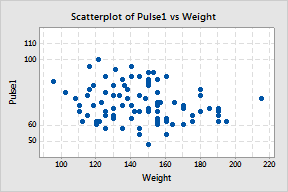
In Example of displaying gridlines you created a simple scatterplot. You can edit this graph's range and labels.
|
Scale 1 Double-click the y-scale. 2 Under Major Tick Positions, choose Position of ticks and enter 50 60 100 110. 3 Under Scale Range, do the following: 4 Click OK. |
|
|
Labels 1 Double-click the y-scale. 2 Click the Labels tab. 3 Under Major Tick Labels, choose Specified. Then enter 50 60-Normal 100-Normal 110. 4 Click OK. |
|