overviews how to examples data see also
Graph > Histogram
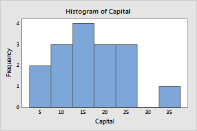
Use to examine the shape and spread of sample data. Histograms divide sample values into many intervals called bins. Bars represent the number of observations falling within each bin (its frequency). In the histogram below, for example, there are two observations with values between 2.5 and 7.5, three observations with values between 7.5 and 12.5, and so on.

Observations that fall exactly on an interval boundary are included in the interval to the right (or left, if the last bin).
|
Note |
If you wish to plot bars representing summary statistics for different groups, use Graph > Bar Chart. After you create a histogram, you can customize the number and location of the bins using Select scale > Editor > Edit > Binning. |