main topic interpreting results session command see also
Suppose you have taken a qualifying exam for entrance into a special training program offered by your company. Only those in the top 10% (90th percentile) will be offered the training. You find out that your score is 1738, but are not yet told what percentile that is. You also learn that the scores are normally distributed with a mean of 1211 and a standard deviation of 320 (see parameters). Use Probability Distribution Plot to find your percentile score for the test.
1 Choose Graph > Probability Distribution Plot.
2 Choose View Probability, then click OK.
3 From Distribution, choose Normal.
4 In Mean, type 1211. In Standard deviation, type 320.
5 Click the Shaded Area tab. Under Define Shaded Area By, choose X Value.
6 Click Left Tail. In X value, type 1738.
7 Click OK.
Graph window output
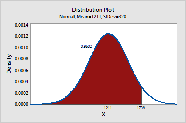
Based on a normal distribution with a mean of 1211 and a standard deviation of 320, 95% of scores are less than or equal to your score of 1738. Thus, your score is at the 95th percentile and you will be able to enroll in the training.