main topic
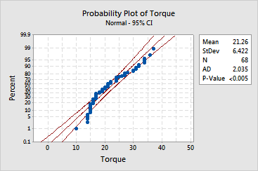
Unlike an empirical cdf graph in which the axes are linear, the y-axis, and sometimes the x-axis, of a probability plot is transformed so that the fitted distribution line (center red line) forms a straight line (see, Method of obtaining probability plot points).
Minitab also displays approximate 95% confidence intervals (curved red lines) for the fitted distribution. These confidence intervals are point-wise, meaning that they are calculated separately for each point on the fitted distribution without controlling for family-wise error. Thus, if you use them to estimate more than one parameter per sample, your chance of making a type I error is greater than your chosen a-level.
Usually, points outside the confidence intervals occur in the tails. In the lower half of the plot, points to the right of the confidence band indicate that there are fewer data in the left tail than one would expect based on the fitted distribution. In the upper half, points to the right of the confidence band indicate that there are more data in the right tail than one would expect. The data in the example above are positively (right) skewed, meaning there are fewer observations in the left tail, and more observations in the right tail, than one would expect.
|
Tip |
If you hover your mouse over a plotted point, Minitab displays the row number and x- and y-values for the point. If you hover your mouse over the fitted line or confidence intervals, Minitab displays values for multiple fitted percentiles and associated confidence bounds. |
The output table displays parameter estimates based on your data (or historical parameters, if you provided them). For the normal and lognormal distributions, Minitab estimates the parameters using least squares estimation. For other distributions, Minitab reports maximum likelihood estimates.
| Minitab help | Stat | Graph | SixSigma | DOE | Glossary | Reliability | SPC,MSA,CPK | ||
|
|||||||||