main topic interpreting results session command see also
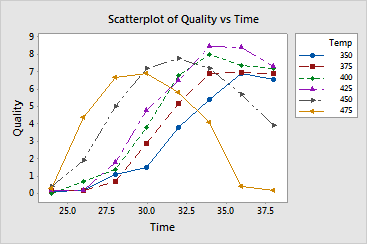
Your company manufactures frozen foods and you need to determine the optimal time and temperature for reheating a new frozen entree. You reheat samples at a number of different times and temperatures, then have trained judges rate each for overall quality on a scale of 0 (not enjoyable) - 10 (most enjoyable). Create a scatterplot with connect lines grouped by temperature to examine the average quality scores.
1 Open the worksheet REHEAT.MTW.
2 Choose Graph > Scatterplot.
3 Choose With Connect and Groups, then click OK.
4 Under Y variables, enter Quality. Under X variables, enter Time.
5 In Categorical variables for grouping (0-3), enter Temp.
6 Click OK.
Graph window output

Not surprisingly, optimal cooking times for lower temperatures are longer
than for higher temperatures. Reheating for too long at the highest temperatures
reduces the quality of the product by burning or drying out the food.
Plotting the data for each temperature on the same graph makes it easy
to see that the optimal time-temperature combination is 34 minutes at
425
Additional examples that help visualize these data include: