main topic
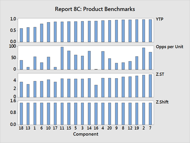
Includes four basic graphs:

In the top graph, identify the components with the worst quality, then read down to the lower charts to determine whether the problem is a result of high complexity (opportunity count), low capability (Z.ST), or poor control (Z.Shift).
In the example above, component 18 has the worst quality, moderate opportunity count, and below average capability. Improving capability will have the largest impact on improving quality.
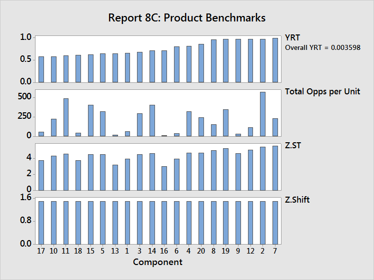
The graphs are adjusted to account for the complexity data:

Remember, the overall YRT represents the probability that a single unit of the entire collection of components can be produced without any defects. The components with the lowest component-level YRT values contribute the most to the overall YRT. Thus, those components are critical in terms of improving overall YRT.
In the example above, component 17 has the lowest YRT, a low opportunity count, and low capability. Raising the average Z.ST for component 17 will have the largest impact on improving its quality, therefore improving the overall product quality.
Component 11 (the third worst component) has a high opportunity count and good capability. Reducing the opportunity count will have the largest impact on improving the quality of component 11, as the capability is already quite good.