main topic interpreting results session command see also
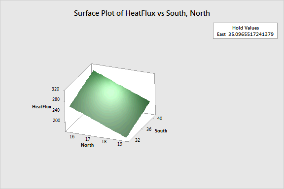
As part of a test of solar energy, you measured the total heat flux from homes. In the multiple regression example, you determined that the total heat flux (HeatFlux) can be predicted by the position of the focal points in the east, south, and north directions. Now, you want to create a surface plot that displays the relationship between the fitted response values for heat flux with the two predictors (North and South) that account for the most variance.
You do not need to re-analyze that regression model. The worksheet contains the model for the surface plot.
1 Open the worksheet SOLARENERGY_MODEL.MTW.
2 Choose Stat > Regression > Regression > Surface Plot.
3 In Response, choose HeatFlux.
4 Under Variables, in X Axis, choose North.
5 Under Variables, in Y Axis, choose South.
6 Click OK.
Graph window output

You can see that the highest values of heat flux are in the upper left corner of the plot, which corresponds with high values of both North and South. The lowest values of heat flux are in the lower right corner of the plot, which corresponds with low values of both North and South. The third predictor, East, is not displayed in the plot. Minitab holds the value of East constant at 35.10 in order to calculate the fitted response values of heat flux.
This plot uses a model equation. Ensure that your model is adequate before you interpret the plot.