
Plot Mixture Design
Mixture Response Plots - Contour Plot
![]()
![]()
![]()
|
|
Plot Mixture DesignMixture Response Plots - Contour Plot |
|
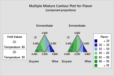
Use a contour plot to help you visualize the response surface. Contour plots are useful for establishing desirable response values, mixture blends, and operating conditions.
A contour plot shows how a response variable relates to three components based on a model equation. Points that have the same response are connected to produce contour lines of constant responses. Because a contour plot shows only three components at a time, while holding any other components and process variables at a constant level, the contour plots are only valid for fixed levels of the extra variables. If you change the holding levels, the response surface changes as well, sometimes drastically.
The display depends on whether the design contains process variables or an amount variable and how you choose to handle these variables. You can display a plot that shows all the levels of these extra variables (as shown here) or just display a single plot.
Example Output |
|
Interpretation |
|
For the fondue data, the interpretation of the contour plots is as follows:
30% Emmenthaler (p = 0.3), 30% Gruyere (p = 0.3), and 40% Wine (p = 0.4)
The proportions of the components must be selected in such a manner that they sum to one.