
Analyze Taguchi Design
Graphs - Scatterplot
![]()
![]()
![]()
|
|
Analyze Taguchi DesignGraphs - Scatterplot |
|
The scatterplots for dynamic response experiments show the responses plotted against the signal. Each cell shows all the data for one of the factor settings in the experiment. The cell contents are as follows:
The graphs are arranged in decreasing order of the signal-to-noise ratio, so that the "best" runs are plotted first. If the experiment has more than nine runs, more than one graph window of scatterplots will be displayed.
Some things to consider when looking at the scatterplots include:
Example Output |
|
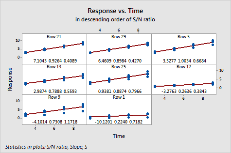
Interpretation |
|
For the basil data, there is a substantial difference in the spread of the data between the best and worst fits.
In some cases, such as the row 9 plot, there seems to be one point at each signal level that diverges sharply below the others. It would be worthwhile to see if this divergence consistently occurs for the same noise condition across the data. The data do not exhibit curvature. As might be expected, the spread of the data increases with the signal level.