|
|
Display Descriptive StatisticsGraphs - Boxplot of Data |
Boxplots summarize information about the shape, dispersion, and center of your data. They can also help you spot outliers.
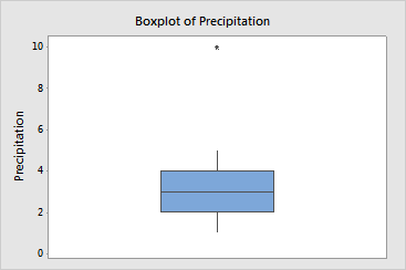
The bottom edge of the box represents first quartile (Q1), while the top edge represents third quartile (Q3). Thus the box portion of the plot represents the interquartile range (IQR), or the middle 50% of the observations.
The horizontal line drawn through the box represents the median of the data.
The lines extending from the box are called whiskers. The whiskers extend outward to indicate the lowest and highest values in the data set (excluding outliers).
Extreme values, or outliers, are represented by asterisks (*).
Use the boxplot to assess the symmetry of the data:
Example Output |

Interpretation |
|
In the boxplot of the precipitation data the median is centered in the IQR box, and the whiskers are the same length. This indicates that except for the outlier (asterisk), the data are symmetric. This is a good indication that the outlier may not be from the same population as the rest of the sample data.