
Orthogonal Regression
Graphs - Fitted line plot
![]()
![]()
![]()
|
|
Orthogonal RegressionGraphs - Fitted line plot |
|
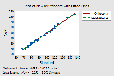
Minitab displays a plot of the data overlaid with a line illustrating the best fitting orthogonal equation. You can also choose to display the ordinary least squares fitted line for comparison.
Example Output |
|
Interpretation |
|
The plot of the glucose data indicates that an orthogonal equation is a good fit for the data. The points are fairly close to the line. The least squares regression line is close to the orthogonal fitted line for these data.