|
|
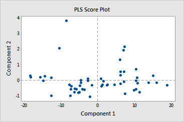
Partial Least SquaresComponent Evaluation - Score Plot |
The score plot is a scatterplot of the x-scores from the first and second components in the model. If the first two components explain most of the variance in the predictors, then the configuration of the points on this plot closely reflects the original multidimensional configuration of your data. To check how much variance in the predictors the model explains, examine the x-variance values in the Model Selection and Validation table. If the x-variance value is high, then the model explains significance variance in the predictors.
|
Note |
If your model contains more than 2 components, you may want to plot the x-scores of other components using Graph > Scatterplot. To do this, store the x-score matrix and then copy the matrix into columns using Data > Copy > Matrix to Columns. If your model has only one component, this plot does not appear in your output. |
When examining this plot, look for:
Example Output |

Interpretation |
|
In this example, brushing the score plot reveals that soybean samples 36, 38, 40, 41, and 42 in the upper quadrants may have high leverage values. Several of these samples have appeared as outliers or leverage points on other plots. Because the first two components describe 99% of the variance in the predictors, this plot adequately represents the data.