|
|
Partial Least SquaresComponent Evaluation - 3D Score Plot |
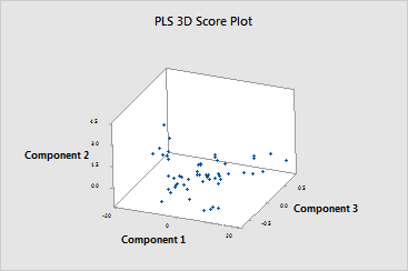
The 3D score plot is a three-dimensional scatterplot of the x-scores from the first, second, and third components components in the model. If the first three components explain most of the variance in the predictors, then the configuration of the points on this plot closely reflects the original multidimensional configuration of your data. To check how much variance the model explains, examine the x-variance values in the Model Selection and Validation table. If the x-variance value is high, then the model explains significance variance in the predictors.
|
Note |
If your model contains more than 3 components, you may want to plot the x-scores of other components using Graph > Scatterplot. To do this, store the x-score matrix and then copy the matrix into columns using Data > Copy > Matrix to Columns. If your model has only one or two components, this plot does not appear in your output. |
When examining this plot, look for:
You should also use the 3D graph tools, which allow you to rotate the plot so you can view it from different perspectives. This will give you a more complete picture of your data and allow you to more accurately identify leverage points and clusters of points.
Example Output |

Interpretation |
|
In this example, by rotating the plot, you can see that soybean sample 42 may be a leverage point because of its extreme score for the second component. Sample 42 was identified as a potential leverage point on other plots.