|
|
Partial Least SquaresComponent Evaluation - Loading Plot |
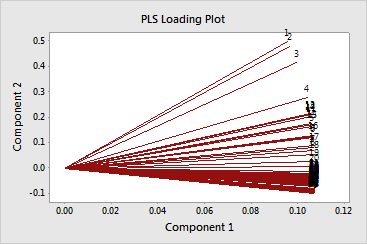
The loading plot is a scatterplot of the predictors projected onto the first and second components. It shows the x-loadings for the second component plotted against the x-loadings of the first component. Each point, representing a predictor, is connected to (0,0) on the plot.
The loading plot shows how important the predictors are to the first
two components and is particularly useful when your predictors are on
different scales. If the components explain most of the x-variance
, which is shown in the Model Selection and Validation table, then the
loading plot indicates how important the predictors are in the x-space.
When considering the importance of the predictors in the entire model,
you must also consider how much variance the components explain in the
responses. To check this, examine the R![]() and predicted R
and predicted R![]() values in the Model Selection and Validation table.
values in the Model Selection and Validation table.
|
Note |
If your model contains more than 2 components, you may want to plot the x-loadings of other components using Graph > Scatterplot. To do this, store the x-loading matrix and then copy the matrix into columns using Data > Copy > Matrix to Columns. |
When examining this plot, look for:
Example Output |

Interpretation |
|
In this example, the loading plot shows that the predictors are highly correlated, because the angles between the lines are small. The lines are almost the same length, indicating the predictors are equally important. On the first component, the predictors have similar positive loadings, indicating they are equally important. On the second component, the first three predictors have greater loadings than the rest.
Examining the Model Selection and Validation table shows that the first two components explain 99% of the variance in the x-space, 79% of the variance in moisture, and 10% of the variance in fat.