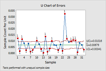
The graphs below show a traditional U chart and a Laney U' chart of the same data. These data are also featured in the examples of the Laney U' Chart and the U Chart Diagnostic. The subgroups are very large, with an average of 7500 observations in each. Additionally, the U Chart Diagnostic test reveals overdispersion in the data.
The large subgroup sizes result in very narrow control limits on the traditional U chart. With the narrow control limits, the overdispersion causes more than half of the subgroups to appear out of control. The Laney U' chart, however, corrects for overdispersion and shows that only one subgroup is actually out of control.

