main topic interpreting results session command see also
Suppose you work for a company that produces several devices that measure radiation. As the quality engineer, you are concerned with a membrane type device's ability to consistently measure the amount of radiation. You want to analyze the data from tests of 20 devices (in groups of 2) collected in an experimental chamber. After every test, you record the amount of radiation that each device measured.
As an exploratory measure, you decide to construct a run chart to evaluate the variation in your measurements.
1 Open the worksheet RADON.MTW.
2 Choose Stat > Quality Tools > Run Chart.
3 In Single column, enter Membrane.
4 In Subgroup size, enter 2. Click OK.
Graph window output
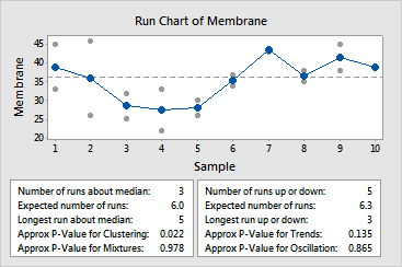
The test for clustering is significant at the 0.05 level. Because the probability for the cluster test (p = 0.022) is less than the a value of 0.05, you can conclude that special causes are affecting your process, and you should investigate possible sources. Clusters may indicate sampling or measurement problems.
|
Note |
The 0.05 level of significance was chosen for illustrative purposes, because it is commonly used in many fields. You can evaluate the significance of tests for nonrandom patterns at any level. When the p-value displayed is less than the chosen level of significance, you reject the null hypothesis - a random sequence of data - in favor of one of the alternatives. See Interpreting the tests for randomness for a complete discussion. |