main topic interpreting results session command see also
Suppose you work at a car assembly plant in a department that assembles engines. In an operating engine, parts of the crankshaft move up and down a certain distance from an ideal baseline position. AtoBDist is the distance (in mm) from the actual (A) position of a point on the crankshaft to the baseline (B) position.
To monitor the process, you collect a subgroup of 5 parts each afternoon and measure the AtoBDist for the parts. After 13 days, you decide that it would be useful to sample the process during the morning shift as well. You decide to collect two subgroups of parts each day, one during the morning shift and one during the afternoon shift.
You have already displayed an X chart with the data to track the process level and test for special causes. Now you want to display an R chart to track the process variation using the same data.
1 Open the worksheet CRANKSH.MTW.
2 Choose Stat > Control Charts >Variables Charts for Subgroups > R.
3 Choose All observations for a chart are in one column, then enter AtoBDist.
4 In Subgroup sizes, enter 5.
5 Click R Options, then click the Tests tab.
6 Choose Perform all tests for special causes. Click OK in each dialog box.
Graph window output
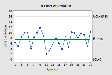
The points are randomly distributed between the control limits, implying a stable process. It is also important to compare points on the R chart with those on the X chart for the same data - see Example of an X chart with tests and customized control limits to see if the points follow each other. These do not - again, implying a stable process.