main topic interpreting results session command see also
As manager of a hospital's intensive care unit, you are concerned about the length of time it takes to admit patients to your unit. To gain an understanding of the process, you begin monitoring admission times. You find that the process is in control, but the variability is large. Before making any changes in the process, your team decides to first standardize the admission procedure for all shifts. This standardization takes place in July.
While studying the admissions process, you discover that you can cut down on switchover time by using the same type of IV line used in the operating room. You implement this change in August.
To share your findings with the staff, you display a historical chart.
1 Open the worksheet ICU.MTW.
2 Choose Stat > Control Charts > Variables Charts for Individuals > Individuals.
3 In Variables, enter ICUadmit.
4 Click I Chart Options, then click the Stages tab.
5 In Define stage (historical groups) with this variable, enter Month.
6 Click OK in each dialog box.
Graph window output
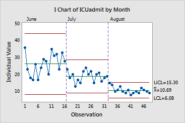
The data in the first part of the Individuals chart are the admission times (in minutes) before any improvements were made. As you can see, the initial standardization in July reduced both the mean admission time and the variation in admission time. In August, improvements to standardized procedure further reduced both mean admission time and variation.
You can label each set of control limits using ... > control chart Options > Display. You can set preferences for this and other displays of control limits, such as changing color or line type, using Tools > Options > Control Charts and Quality Tools.