overview how to example data see also
Stat > DOE > Factorial > Contour Plot
Use a factorial design model to generate a contour plot for a single pair of variables or separate contour plots for all possible pairs of variables. Contour plots show how the fitted response relates to two continuous variables. A contour plot provides a two-dimensional view where all points that have the same response are connected to produce contour lines of constant responses.
Minitab generates the graph by calculating fitted responses (z-values) using the x- and y-variables while holding any additional variables constant at the values that you specify in the <Settings> dialog.
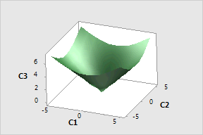
Below is an example of a contour plot with a surface plot of the same data for comparison. The lowest z-values are found where C1 and C2 both equal zero. As C1 and C2 move away from zero, the values for C3 increase steadily. This is represented in the contour plot as concentric contours of increasing value, and in the 3D surface plot as an inverted cone.
|
Contour Plot |
Surface Plot |
|
|
|
See Stored Model Overview for a discussion about how to use stored models.
Response: Choose a response variable from the drop-down list.
Variables:
Select a pair of variables for a single plot: Choose to display a graph for just one pair (x,y) of variables that you specify with the calculated response (z).
X Axis: Choose a variable from the drop-down list to plot on the x-axis.
Y Axis: Choose a variable from the drop-down list to plot on the y-axis.
Generate plots for all pairs of continuous variables: Choose to generate graphs for all possible combinations of (x,y) variables with the calculated response (z). With n variables, (n*(n-1))/2 different contour plots will be generated.
In separate panels of the same graph: Choose to display all plots on one graph.
On separate graphs: Choose to display each plot on a separate page.