main topic interpreting results session command see also
In the Example of analyzing a full factorial design with replicates and blocks, you were investigating how processing conditions (factors) - reaction time, reaction temperature, and type of catalyst - affect the yield of a chemical reaction. You determined that there was a significant interaction between reaction time and reaction temperature and you would like to view the response surface plots to help you understand the nature of the relationship. Because the effects due to block and catalyst are not significant, you did not include them in the plots.
You can also view main effects and interactions plots.
You do not need to re-analyze the model. The worksheet contains the stored model that is necessary for the contour plot.
1 Open the worksheet YIELDPLT.MTW. (The design, response data, and model information have been saved for you.)
2 Choose Stat > DOE > Factorial > Contour Plot.
3 In Response, choose Yield.
4 Under Variables, in X Axis, choose Time.
5 Under Variables, in Y Axis, choose Temp.
6 Click OK.
Graph window output
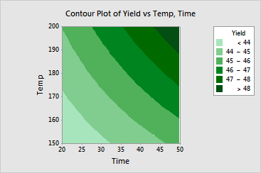
The contour plot shows that Yield increases as both reaction time and reaction temperature increase. Because there are 4 contours across the top of the plot and 3 contours across the bottom of the plot, the plot shows that the increase in yield from the low to the high level of time is greater at the high level of temperature.