main topic
You can represent the data with interval bars, bars, symbols, and connect lines. If you have grouping variables, you can assign different attributes to each group. In the Example of an interval plot with groups, you assess the durability of four experimental carpet products. You want to customize the data display.
|
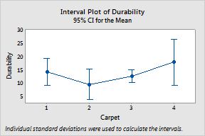
Interval bar, mean symbol, and mean connect line 1 Open the worksheet CARPET.MTW. 2 Choose Graph > Interval Plot. 3 Under One Y, choose With Groups. Click OK. 4 In Graph variables, enter Durability. 5 In Categorical variables for grouping (1-4, outermost first), enter Carpet. 6 Click Data View. 7 Check Mean connect line. 8 Click OK in each dialog box. |
| ||
|
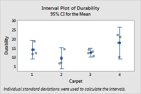
Interval bar, mean symbol, and individual symbols 1 To recall the last dialog box, press [Ctrl]+[E]. 2 Click Data View. 3 Uncheck Mean connect line. 4 Check Individual symbols. 5 Click OK in each dialog box.
|
| ||
|
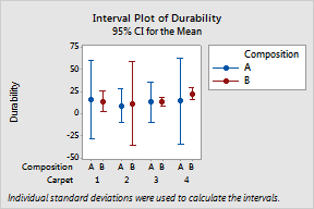
Interval bar, mean symbol and an additional categorical variable for attribute assignment 1 Press [Ctrl]+[E]. 2 In Categorical variables for grouping (1-4, outermost first), add Composition. 3 Click Data View. 4 Uncheck Individual symbols. 5 In Categorical variables for attribute assignment, enter Composition. 6 Click OK in each dialog box. |
|