overview examples see also
|
|
When creating a graph, you can display labels to identify and explain your graph or your data points. After creating a graph, you can:
|
Note |
Axis, tick, reference line, and percentile line labels are associated with the graph scale (see Scale Overview). Panel labels are associated with their panels (see Paneling Graphs). |
|
Label type |
Example |
|
|
|
Add up to three titles and two footnotes to all graphs. By default, titles appear centered over the graph; footnotes appear at the lower left. | |
|
|
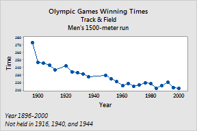
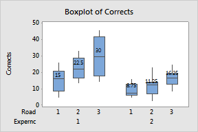
Label individual data points, medians, means, outliers, and endpoints. | |
|
|
Display the frequency for each bar of the histogram. | |
|
|
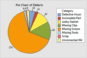
Label slices in a pie chart with category names, frequencies, or percents. |