|
|
Partial Least SquaresModel Evaluation Plots - Coefficient Plot |
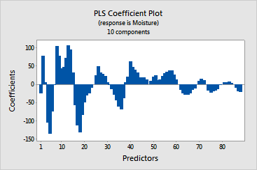
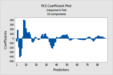
The coefficient plot is a projected scatterplot showing the unstandardized coefficients for each predictor. Minitab provides one coefficient plot per response.
Use this plot, along with the output of regression coefficients to compare the sign and magnitude of the coefficients for each predictor. The plot makes it easier to quickly identify predictors that are more or less important in the model.
Because the plot displays unstandardized coefficients, you can only make comparisons among the magnitude of the relationships between predictors and the response if your predictors are on the same scale (for example, spectral data). Otherwise, use the standardized coefficient plot or use the loading plot to compare the weights of predictors used to calculate the components.
Example Output |


Interpretation |
|
In this example, the predictors (spectral data) are on the same scale. Both plots indicate that wavelengths 1 - 40 have the greatest influence on the responses. The signs of the predictors are similar for both fat and moisture, except for wavelengths 51 - 61, which are positively related to moisture and negatively related to fat.