|
|
Partial Least SquaresModel Evaluation Plots - Standardized Coefficient Plot |
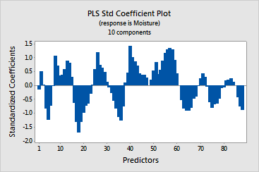
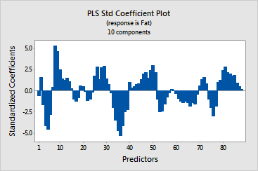
The coefficient plot is a projected scatterplot showing the standardized coefficients for each predictor. Minitab provides one standardized coefficient plot per response.
Use this plot, along with the output of regression coefficients to compare the sign and magnitude of the coefficients for each predictor. The plot makes it easier to quickly identify predictors that are more or less important in the model.
Because the plot displays standardized coefficients, you can make comparisons among the magnitude of the relationships between predictors and the response even if your predictors are not on the same scale.
If your predictors are on the same scale, the pattern of coefficients in standardized and unstandardized plots look similar. These plots may not look identical, though, because the predictors are highly correlated, causing the coefficients to be unstable and because of differences between sample standard deviations and population standard deviations.
Example Output |


Interpretation |
|
In this example, the predictors (spectral data) are on the same scale, so the pattern of the coefficients looks similar to the pattern shown in the unstandardized coefficient plot. The signs of the coefficients are the same, although the relative magnitude among the coefficients for each response varies slightly from the unstandardized coefficients.