main topics interpreting results session command see also
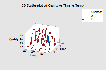
Your company manufactures frozen foods and you need to determine the optimal time and temperature for reheating a new frozen entree. You randomly assign two operators to reheat samples at a number of different times and temperatures. Three trained judges then rate each sample for overall quality on a scale of 0 (not enjoyable) - 10 (most enjoyable), and the average quality scores are recorded. Create a 3D scatterplot with project lines grouped by operator to illustrate the quality scores.
1 Open the worksheet REHEAT.MTW.
2 Choose Graph > 3D Scatterplot.
3 Choose With Groups, then click OK.
4 In Z variable, enter Quality. In Y variable, enter Time. In X variable, enter Temp.
5 In Categorical variables for grouping (0-3), enter Operator.
6 Click Data View.
7 Under Data Display, check Project lines. Click OK in each dialog box.
Graph window output

The operator does not appear to make a systematic difference in perceived quality.
Reheating at the shorter time intervals results in under-cooked product
and low quality scores. However, reheating at the longest intervals combined
with the highest temperatures also results in low scores because the food
becomes over-cooked. The optimal settings appear to be between 400
Adding the project lines helps you visualize each point's position in three-dimensional space. Rotating the graph and viewing it from different angles can also help.
Additional examples that help visualize these data include: