overview
Use these graphs to assess and compare properties of distributions, such as:
|
Graph |
Uses |
|
Histogram
|
Use a histogram to evaluate the shape and central tendency of your data, and to assess whether or not your data follow a specific distribution such as the normal distribution. Bars represent the number of observations falling within consecutive intervals or bins. Because each bar represents many observations, a histogram is most useful when you have a large amount of data. Display options include fitted distribution and lowess lines. |
|
Dotplot
|
Use a dotplot to evaluate the shape and central tendency of your data. Like a histogram, a dotplot is divided into bins. However, a dotplot can be more useful than a histogram when you have a small amount of data because: Dotplots are also useful for comparing groups of data. |
|
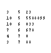
Stem and Leaf
|
Use a stem-and-leaf plot to display the actual data values in a binned format. Though similar to a dotplot, a stem-and-leaf plot: |
|
Probability Plot
|
Use a probability plot to: Minitab plots the value of each observation against its estimated cumulative probability. The scales are transformed as necessary so that the fitted distribution forms a straight line. Display options include confidence intervals and percentile lines. |
|
Empirical CDF
|
Use an empirical cdf (cumulative distribution function) graph to: Minitab plots the value of each observation against its actual cumulative probability. Unlike a probability plot, the scales of an empirical cdf are not transformed and the fitted distribution does not form a straight line. Display options include percentile lines. |
|
Probability Distribution Plot
|
Use a probability distribution plot to: |
|
Boxplot
|
Use a boxplot to assess and compare distribution characteristics such as median, range, and symmetry, and to identify outliers. Display options include symbols for the mean and boxes for the median confidence intervals. |