data
You can use control charts to track process statistics over time and to detect the presence of special causes.
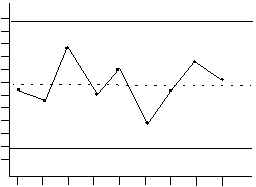
Minitab plots a process statistic, such as a subgroup mean, individual observation, weighted statistic, or number of defects, versus sample number or time. Minitab draws the:
|
Quality characteristic |
Sample number (or time) |
Upper control limit Center line Lower control limit |
Special causes result in variation that can be detected and controlled. Examples include differences in supplier, shift, or day of the week. Common cause variation, on the other hand, is inherent in the process. A process is in control when only common causes - not special causes - affect the process output.
A process is in control when points fall within the bounds of the control limits, and the points do not display any nonrandom patterns. Use the tests for special causes offered with Minitab's control charts to detect nonrandom patterns in your data.
You can also perform a Box-Cox transformation on non-normal data.
When a process is in control, you can use control charts to estimate process parameters needed to determine capability.
Minitab offers a variety of options for customizing your control charts:
See Control Charts for the types of control charts available.